FINAT, the European label industry association, is pleased to announce the winners of the 2022 FINAT Label Competition. The awards ceremony was held on the 1st of June on the occasion of FINAT’s 64th annual conference, the European Label Forum, at the Grand Hotel Dino in Baveno, along the borders of Lago Maggiore (Italy).
The competition is organised on an annual basis and as usual FINAT were able to rely on the experience and services of an expert and dedicated team of judges. The judging panel was led by Tony White of AWA Consulting ably supported by Murat Sipahioglu, Sales Director of IMEKS Group and Steve Wood, the owner of Steve Wood Services. Samples of all the entries were distributed to the judges by FINAT’s Event & Publications Manager, Jakovina van Haeringen after collating the entries along with the respective technical information as they were received over many weeks. The labels were then sent physically to the three judges for their independent and crucial initial assessments before meeting virtually to determine the final winning entries.
The competition attracted 205 entries from 38 companies from 21 countries worldwide. In addition to the 7 Group winners and the 34 Category winners a total of 73 Highly Commended certificates were distributed. The leading number of countries entering this year was led by Austria with 32 entries with Turkey close behind with 26 entries. The number of entries in each category was predictably led by Wines (46), Alcoholic Drinks (36), Sets of Labels (22) and Cosmetics (17). The number of entries printed using digital technology (108) continues to increase year on year by more than 30%. The digital element is becoming more noticeable, not only in the printing process but also in the finishing, die-cutting and in the final use of the label.
BEST IN SHOW WINNER
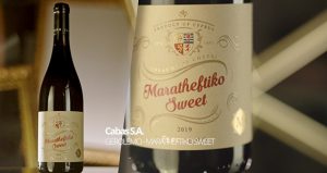 The story behind the Best In Show label for the 2022 FINAT Label Competition involves history dating back to the Middle Ages. The label reflects an era of Kings, Knights and Royalty referring to the “Kingdom of Cyprus” (a Crusader Kingdom) which was founded in 1197 six years after the occupation of Cyprus by Richard the Lionheart of England. The reproduction of the Coat of Arms depicts three rampant lions and a cross is reproduced in great detail and along with the “flourishes” surrounding the shield and the product name gives that royal feeling to the excellently printed label. The combined combination of great gold foiling and High Build varnish against a smooth matt sand coloured recycled paper meant that Gerolemo – Maratheftiko Sweet entered by Cabas S.A., Greece was selected by the panel of judges as the Best In Show winner. (This label also won the Digital Group Award at the 42nd Annual Competition.)
GROUP WINNERS
The Group winners are organised into the following main groups which include A. Marketing/End Uses, B. Printing Processes, C. Non-Adhesive Applications, D. Innovation & Electronic Printing and E. Digital Printing.
Group A: Marketing/End-uses
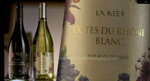 The jury could not separate two entries for the Marketing/End –Uses Group therefore joint winners were awarded. The first winner was Marzek Etiketten+Packaging GmbH, Austria for Côtes du Rhône. This is a bright and colourful label. The black line round the images of the flowers serves to highlight them and to give them a clear separation from the clean bright substrate. Printed digitally with a very accurately placed screen varnish in four colours, the silky appearance of the substrate adds a real touch of class to the label and projects the images of the flowers into high relief. The subtle use of hot foiling to highlight the name of the wine is excellent. A 67lpcm screen gives great definition to the main images of the flowers.
 The second winner was Ҫiftsan Label & Packaging Company, Turkey for Alqaissi Grill Spices. A very busy and complicated label. The use of a metallised film substrate adds overall brightness to the label and gives the impression that gold foiling has been used. The application of matt lamination contrasts nicely with the high gloss varnish over the image of the meat. Both the fine line black type and the reversed out white type are printed to a very high standard. The basic printing process is digital. With this label the more you study it the more detail becomes obvious. How many observers noticed the highlighted glossy image of the fork above the meat board or the shiny green leaf? A really well designed and high quality label with masses of detail to hold the interest of the observer.
Group B: Printing Processes
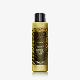 The winner of the Printing Processes Group was Kuresa, Peru for Body Spa Conditioner. A very understated label printed using a combination of letterpress and screen technology in six colours on a film substrate. The label contains some very fine typography using an opaque white screen ink. The subtle green background shows a branch of a pepper tree and red peppers depicting the plant from which the product is manufactured. A 150lpi screen adds a high degree of definition to the final result.
Group C: Non- adhesive Applications
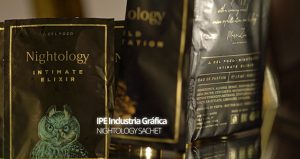 The judging panel found it impossible to separate two labels in the Non-Adhesive Applications Group so again we are presented with two group winners. The first was IPE Industria Gráfica, Spain for Nightology Sachet. Flexography has been used to great effect on a matt silver metallic substrate. The white reversed out printing on the black background obviates the need for using foiling to highlight both the type and the illustrations. The detail in the lions head is excellent making it stand out against the background. Printed in five colours which includes a primer, gold lacquer two blacks, PMS 7509 and an overall matt varnish. The lion’s head with all its fine detail appears majestically dominant and needs no further images to support it.
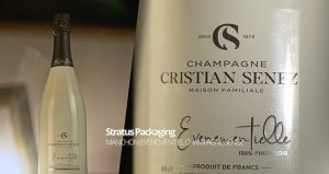 The second winner was Stratus Packaging, France for Champagne Christian Senez Evenementielle. A sleeve that spells out quality at first glance and reflects the quality of the product, champagne. One colour, black, has been printed by flexo to a very high standard and is augmented by a touch of silver cold foiling. The silk screen varnish on the logo and signature adds that extra touch of class once more. The intense black images are complemented by printing on a High White PET 45 high-shrink substrate. In this case less is more! The images including the two silk screen varnishes which were required resist shrinkage during the steam process.
Group D: Innovation & Electronic Printing
 The Innovation Group is always interesting to judge as we are regularly presented with new technology and different applications for the label press output. The winner of the Innovation and Electronic Printing Processes Group was Schreiner Group GmbH & Co. KG, Germany for Robust RFID-Label. It is important that when a RFID chip is used to identify or track a medication it does not get compromised during its useful working life. The Robust RFID Labels features a unique and innovative design. The label-integrated RFID chip is secured by the label’s special construction featuring protective printed elements. This means that potential damage to the RFID chip, for example mechanical impact during the manufacturing and handling processes can be avoided enabling higher production rates and continued functionality during the lifetime of the pharmaceutical product. Digitisation is an emerging trend in healthcare scenarios. A considerable amount of information about a pharmaceutical product can be carried on a single RFID chip for example to enable interactions between the patient and their medical treatment. It is key that the performance and functionality of the chip is not impaired in any way due to damage during its working life. Therefore robustness of the label is the key.
Group E: Digital Printing
 The winner in the Digital Printing Group was CABAS S.A., Greece for Gerolemo –Maratheftiko Sweet. This label was printed digitally in four colours with the addition of dedicated silk screen and gold foil areas revealing design details that will trigger the consumer’s emotive response in the description of the product. The substrate was selected to add a touch of luxury and high added value to the finished result. The substrate used for this label is a recycled paper and is therefore a responsible choice yet giving premium quality. Overall this is a responsible label which tells a story and aims to create a sense of luxury and leave a lasting impression with the consumer even before the cork is removed.
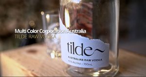 This year, the Judges Award was given to Multi-Color Corporation, Australia for Tilde Australian Raw Vodka. A technical complicated label which is best described by the converter’s own technical explanation. ”Two label substrates were used, a coated poly film on the underside printed in CMYK + Toyo Black up to Unit 4 on the press then a Contone Bianco top substrate which is separated and joined to the poly film bottom stock at unit 5. Printing continues with two greys and Toyo Black with a Highbuild screen and finished with a spot Matt varnish and final die cut. Eventually five colours were used along with a 200 lpi screen.”


